The number of pregnancy-related deaths in the U.S. rose in 2020, the first year of the pandemic, according to a recent report from the Centers for Disease Control and Prevention. The report finds there were 23 deaths per 100,000 births, which is up from 20 in 2019. The report did not examine what role the pandemic played in the increase, but it could have been related to people delaying visits to health-care providers.
The report also cited racial disparities, as the maternal mortality rate for Black women was three times higher than for white women. The U.S. has the highest maternal death rate among developed countries and is the only industrialized nation where the numbers are increasing. (See factsheet.)
Black women in Texas are “disproportionately” impacted as they account for 11% of live births but 31% of maternal deaths. Texas has the highest number of uninsured residents in the U.S. and the highest percentage of uninsured women of childbearing age. Black women have higher rates of preterm birth, low birthweight, and increased infant mortality, according to Babyscripts, a virtual maternal care company. Black women are most likely to be uninsured, fall into coverage gaps when Medicaid is not expanded, and experience higher rates of chronic disease. The upcoming Black Maternal Health Week (April 11-17) will focus on these challenges in maternal health.
Some leading causes of maternal death include infection, hemorrhage, preeclampsia, and cardiovascular conditions. Studies indicate 80% of maternal deaths are preventable. Symptoms include severe headaches, dizziness, vision impairment, fever, swelling in the hands or face, depression, vaginal bleeding, suicidal thoughts, and difficulty breathing. If you have friends with these symptoms, listen to their concerns and encourage them to seek immediate care. You can also offer to go with them to the provider and talk with the doctor.
A Texas maternal mortality and morbidity review committee in 2013 found approximately one-third of pregnancy related deaths in Texas in 2013 occurred 43 days to a year after the end of pregnancy. The committee also discovered that a very high percent of these deaths could have been prevented. Since 2016, the committee’s most important recommendation has been to extend Medicaid postpartum coverage for low-income mothers to a year. The American Medical Association and the American College of Obstetricians and Gynecologists advocate for longer postpartum care.
To address maternal deaths, the American Rescue Plan Act, signed into law by President Biden in 2021, allows states to extend Medicaid coverage for a full year postpartum. Texas’s most recent legislative session addressed postpartum coverage. The state House passed a bill to extend our postpartum coverage to 12 months — meaningful legislation to address disparities in maternal health care. Unfortunately, the legislation was modified in the Texas Senate to reduce the coverage to six months. While we are glad to have increased maternal coverage, the legislation fell short of what is needed in Texas, though allowed by Medicaid. Dallas House member Toni Rose said, “When it comes to saving lives of Texas mothers, ‘splitting the difference’ is not appropriate.”
When our legislature convenes next year, two items will save lives in Texas: extending postpartum coverage to 12 months and expanding Medicaid coverage to approximately 1.5 million Texans. Many of these uninsured residents are people of color and the most vulnerable to maternal mortality.
We can help the maternal mortality problem in Texas by working collaboratively for increased health-care coverage, access, and outcomes for the good of all Texans.
Stephen Love is President/CEO of the Dallas-Fort Worth Hospital Council.
As the battle over abortion rights flares anew at the state and federal levels, American public opinion on the legality and morality of abortion has been notably stable these past several years, according to Gallup surveys from 2014 to 2021. A majority of Americans agree that abortion should remain a legal option.
How wide or narrow the legal window should be varies by community type, according to an analysis by the American Communities Project. On the whole, residents in diverse, urban, economically stratified communities that voted for Democrats Hillary Clinton or Joe Biden support broader legality. Those in rural and religious communities that voted for Republican Donald Trump tend to want more constraints.
On the moral question, Americans are nearly split between whether abortion is acceptable or unacceptable. Here, too, place of residence plays a role in how people see the issue — but views are deeper and diverge much more between urban and rural communities.
Parsing Legality
Overall, 42% of Americans support abortion being legal under any or most circumstances, while another 36% say it should be legal in only a few circumstances, and 19% say it should be illegal in all circumstances, according to Gallup surveys from 2014 to 2021.
When drilling down by the American Communities Project typology, the diversity of racial/ethnic backgrounds, urban geography, stratified socioeconomic conditions, political orientation, and youth populations likely account for supportive views of abortion rights. The 106 Urban Suburbs ringing cities, the 47 Big Cities, and the 154 College Towns show the most support for legal abortion in any circumstance at 35%, 34%, and 32%, respectively. These community types supported Biden and Clinton in 2020 and 2016, respectively.
Comparatively, a plurality of Evangelical Hubs, Rural Middle America, and Military Posts say abortion should be legal in only a few circumstances. These communities are broadly characterized by adherence to tradition, religion, and discipline, and most sit in rural America. They all supported Trump in 2020 and 2016 by large margins.
For the 372 Evangelical Hubs, lower-income, less college-educated, evangelical Christian communities in the South and Midwest, 46% say abortion should be legal in only a few circumstances.
For the 89 Military Posts, middle-income, younger, mostly rural communities scattered around the country, 44% hold the same view.
For the 599 Rural Middle American middle-income counties stretching along the upper half of the county, it’s also 44%.
When it comes to making abortion illegal in all circumstances, none of the communities is even close to 50% supporting, though a few hover close to one-third.
32% of those in the 161 Hispanic Centers based in the rural Southwest, Texas, and Florida, which are home to younger, lower-income, Latino-dominated populations;
32% of those in the 337 Working Class Country communities in Appalachia, the Ozarks, and the upper Midwest, with lower-income, less-diverse, and less-college educated residents; and
31% of those in the Evangelical Hubs.
Probing Morality
The question of morality is fraught and split. Overall, 44% of Americans see abortion as morally acceptable, 47% say it is morally unacceptable, and 8% say it depends on the situation, according to Gallup surveys.
Digging in at the community level shows a deep divide by rural/urban geography. Abortion is considered morally acceptable for 52% of residents in Big Cities, 50% of those in College Towns, and 49% in Urban Suburbs.
Sizable majorities in most kinds of rural communities consider abortion morally unacceptable, including:
These surveys illustrate how Americans’ views are clear and consistent on an issue that continues to divide the nation. But a majority of Americans also continue to agree that abortion should be legal in at least some circumstances.
NOTE: This post originally also referenced the Aging Farmlands, LDS Enclaves and Native American Lands. Those references were removed because the polling sample sizes were too small.
Today in a time of a global pandemic, economic upheaval, and political turmoil, The Harwood Institute for Public Innovation set out to gain a deep understanding of how Americans from all walks of life, from communities across this country, experience their lives and see the nation. Given the complex challenges facing the country, the Institute wanted to ensure that we engaged a genuine cross-section of Americans. So, we turned to the American Communities Project (ACP) to help us find a collection of voices.
We routinely hear that Americans are “polarized,” but in our work, we found that this word sorely misdiagnoses what ails us. Rather than being “polarized,” Americans are profoundly isolated and disoriented, producing a fight or flight response within people. The Harwood Institute will release our newest study early next year.
“A Walk Across the Country”
We chose to work with American Communities Project because of its rigorous and robust typology of the U.S. Importantly, the ACP’s framework captures and reflects the diverse cultural, socioeconomic, and political perspectives of the country. And the ACP typology is backed up by the best academic research and journalism in America.
In 1991, The Harwood Institute released “Citizens and Politics: A View from Main Street,” the first in-depth study to reveal Americans did not feel “apathetic” about politics but felt disconnected and pushed out. That report received widespread national attention and helped to reframe public discourse. Since then, we have traveled the country every three to five years to engage Americans on the state of the country and their lives. Now, almost exactly 30 years after our initial report, we set out once again to understand the mood of America. This time, we “traveled” the country via Zoom.
A Critical Framework
We activated our network of public innovators to host in-depth, two-hour focus group conversations (see map below) in each of the 15 county types that make up the ACP framework. Our partners included a variety of entities each deeply rooted in their respective community; conversation organizers included community foundations, United Ways, public libraries, a public media station, committed individuals, a Native American organization, among others.
A View of America
In our conversations, we found that conventional wisdom about how Americans are experiencing the state of the nation and their lives is wrong in 2021 just as it was in 1991. This new report reveals there is another virus infecting the nation — a civic virus that has been incubating and mutating for decades — that is pervasive, contagious, and perilous to our civic health.
Our forthcoming report details the nature and effects of this civic virus and what we can do about it. Here’s a quick summary of what we found:
● People are separating and segregating themselves from one another due to unrelenting fear and anxiety about what’s happening around them and to them;
● Many leaders and news media are intentionally stoking polarization for their own self-interest, with social media helping to create and amplify these divisions. This is producing a ceaseless surround sound that is engulfing people, subjecting people to an alternate reality that confuses, disorients, and destabilizes them;
● Seeing no way out, people are in an instinctive fight or flight response, many breaking up into smaller “tribes” and camps to protect themselves and gain validation, while others retreat from engaging at all.
In the time since “Citizens and Politics,” the conversation in the nation has shifted dramatically — from the problem is “out there” involving elected officials, news media and special interests to the problem is now “within all of us.”
Making use of the ACP typology, The Harwood Institute was able to tap into distinct areas of the country; and while we heard differences in how people are experiencing life and see the nation from place to place, we heard an unmistakable message across these areas about how isolated and disoriented people feel today — something fundamentally different from polarization.
For those who are interested in the state of our nation, and what can be done to bring people together and get things done, this will be an important report. Join The Harwood Institute’s newsletter to be the first to receive this new report, which will be released in early 2022.
Associate Professor Nikki Usher on her new book, “News for the Rich, White, and Blue.”
University of Illinois Associate Professor Nikki Usher is an expert on news production in the shifting digital environment — a hot topic, growing more pressing amid distrust and inequity. Her latest work News for the Rich, White, and Blue: How Place and Power Distort American Journalism explores how the news industry got to this place and how it can achieve a more equitable future.
Recently, I caught up with Usher to find out more about trends in news, how the ACP types aided her research, and her recommendations for making journalism better.
Ari Pinkus: Why and how is news skewed to “the rich, white, and blue”?
Nikki Usher: Well, to some extent news has long been skewed to the rich and white — those are audiences that have long been desirable to sell to advertisers (we forget that news outlets are really reselling audience attention to advertisers).
Now that the digital ad model has collapsed, we’ve got a situation where revenue has to come from readers. That means digital subscriptions or memberships — and the news (or at least high-quality news) becomes limited to those who can/will pay/realize the social value of paying for news, and reifies existing problems with the presumption of white audiences as the main customers.
Newsrooms, too, are increasingly struggling with diversity, as it becomes more and more financially precarious to take the risk of becoming a journalist — and that has a downstream impact for coverage.
The blue part, well, that’s the part that’s maybe most depressing: the vast majority of people who still trust the news media — or the news media as anyone on this site might define it — well, they’re blue — democrats. This is just the reality of the mainstream news media’s audience. These audiences remain the ones willing to pay, especially for subscriptions to midsize and national news outlets.
Pinkus: How have media outlets become out of touch with the democracy they are supposed to serve?
Usher: The biggest news outlets with the biggest national news audiences are those most likely to survive. There aren’t that many, so you might think: New York Times, Washington Post, CNN, and some digital-first outlets, maybe.
This has two consequences: These large outlets are simply not embedded in communities — and to work at them, you have to be top of the line or seen as such, which often involves having elite credentialing. This means that the type of people in newsrooms, the type of places they are from or see themselves as belonging to, well, they simply are disconnected from a lot of what we see in rural or multicultural places in the U.S.
When it comes to newspapers, which have long provided the most original coverage about any one place, we see significant cutbacks in many, many communities — so journalists are literally growing geographically farther from people and there are fewer to cover bigger expanses of geography. There’s a physical distancing, too, and that compounds cultural, political, and social distancing. I was able to figure this out in part because I was more interested in the types of places that were losing news versus just the geographic or political orientation of places losing news.
Pinkus: How did the American Communities Project typology help you in your research?
Usher: I used the ACP typology for two chapters in the book — and I can’t imagine thinking about the loss of news and the potential for rehabilitating local news without thinking about the types of communities that are losing news.
What ACP’s typology offers is a way to think about places that is tangible and evocative and methodologically discrete enough to stand up to peer review. The cluster analysis is not just demographic, it also includes marketing data, which to me, makes it much closer to how life is lived versus a county of people in a place. When you say African American South or Exurbs, the places and your imaginaries of them are immediately evident — and that makes America into more than just blue and red, rural or urban, coastal/heartland.
When you mix in other data, like Bureau of Labor Statistics data on newspaper employment per county or the UNC News Desert data set, all of a sudden, the trends become so much more visible — you can imagine in your head what it might mean, for instance, when Rural Middle America experiences a contraction in local news and imagine these places and these scenarios in your head (particularly if you’ve been in places that map on to the typologies).
So for one chapter, we looked at where so-called news deserts were, what political leans they had, and whether journalists were indeed further concentrating in big, blue cities, which ACP calls, conveniently, “Big Cities.”
In another chapter, we looked at where flows of nonprofit philanthropic dollars for investigative journalism were going — were they going to places that had a deficit of news coverage relative to their population? Were these dollars flowing more to one community type versus another? Was there evidence that philanthropy for journalism was just going to end up reproducing the same inequities and exacerbating the same problems that the commercial news media had created and fostered?
Pinkus: What surprised you most in your findings?
Usher: This book felt like a journey of discovery, so I wouldn’t say there was just one finding that surprised me.
But when it comes to what the ACP data helped me see: well, first, there are places that have simply always been so-called news deserts. Some places — some community types — have just been historically overlooked and underinvested by the commercial news media. I mean, this is a central point to the book, so it was helpful to say, you know, the Native American Lands, the African American South, and Working Class Country have not (by our data) had many journalists working in them to begin with, so they were already “news deserts” even before major contractions in the news industry.
I was also surprised to find that when you look within-industry trends for journalism that Republican counties have more journalists relative to Democratic counties — it’s not a story of red, rural America losing the news, it’s a story of some places never having had much news, and places all over losing journalism.
I was not surprised, but a little disturbed in fact, to find that most of the nonprofit dollars flowing to investigative journalism were going to big blue cities and college towns — big city foundations giving to places that they were already familiar with. That was even more of an indication to me that there were really problematic trends in the political economy of the news media, or how the money and the power flow when it comes to making sure that people have access to news and information that gives them a sense of place and a stake in democratic life.
Pinkus: What does the local news landscape look like today?
Usher: It depends where you are and it depends what it means to be local. Many places with solid resources — wealth, educated populations, a strong sense of civic efficacy or community — those places may be losing legacy news media, but they are replacing them in many cases with some really fantastic digital-first efforts, from small-town blogs to what I’ve been seeing in Chicago, which are locally-focused, service-minded digital first outlets dedicated to serving specific communities with news that they need to navigate daily life.
In other places, there are these weekly local newspapers that were never “hard news” to begin with, and often quite conservative, actually, and those are struggling to survive. They simply can’t keep up with fast-moving information needs (consider Covid-19) and the advertising base in many rural areas is simply, well, Graying America, Aging Farmland — let’s just say these places are losing people and losing businesses, too. There’s no advertising base, a limited population to serve, and people need more on-demand news.
That’s where platforms like Facebook come in — serving as a place for people to seek out information not just about the country but about where they live, and community news pages have become the front page, home page, and bulletin board for many local communities. This is a real problem, because Facebook is NOT a company that prioritizes democracy, it prioritizes profit.
Pinkus: Where do you see it heading?
Usher: This is a great question. The darkest version of the outcome: the New York Times, the WSJ, and the Washington Post are the only daily newspapers left standing, and have dispensed reporters to places that have limited local news to meet a need of would-be local news subscribers.
These journalists would be coming from the big cities with limited local knowledge but lots of journalism chops, and other than local television news, which is nominally local, and public media, which is chronically under-resourced, that might be all we have.
Or, we end up moving past the idea that journalism needs to look like journalism, a professional product — and unbundle journalism — some local institutions can provide news, but journalists can dedicate their efforts to the unique contributions that only journalists can make (probably accountability journalism).
Pinkus: What are your recommendations for how journalism can better reflect and address the diversity of issues and readers across the country?
Usher: First, I think we need to diversify and empower journalists from historically marginalized groups — BIPOC, Rural America, and so forth.
If we are going to have a partisan media environment, we might as well lean into it — and maybe we should encourage partisan original news gathering (heresy, I know) — and perhaps even party donor-based news, which definitely is happening on the Right.
I think we need to seriously think about how to reform higher education in ways that diversify all industries but would diversify journalism, too — change student federal work study to include participation on college campus publications or college internships at public media on university campuses, make working for nonprofit journalism outlets clearly part of student financial aid relief, and provide meaningful salaries with health insurance rather than scattered fellowships to people from historically marginalized groups.
Covid-19 vaccination rates continue to rise across all the community types in the American Communities Project, but not at the same rate. Some places that were initially slow to get jabbed have seen a notable uptick in injections, but others have slowed.
The net result: The national full vaccination number is about 52%, but there is a wide gap between the top and bottom community types (the Urban Suburbs and Evangelical Hubs, respectively) and it has not closed. This trend continues the uneven landscape that may make containing the virus difficult. However, the speed at which vaccinations are increasing in other places might also be viewed as a hopeful sign for those communities. (A person is considered fully vaccinated two weeks after receiving the second dose of the Moderna or Pfizer vaccine or receiving one dose of the Johnson & Johnson vaccine.)
On the whole, the data suggest that the big dangers from Covid — serious cases and hospitalizations — are likely to be a function of the kind of community in which you live and the people with whom you socialize.
Climbing Above 50%
When the ACP and the US COVID Atlas last checked on vaccination rates in our 15 types in late September, we found seven of them had full-vaccination rates of 50% or more. That number has now climbed to 10 communities types where the fully-vaccinated rate is above 50%.
They are, in order of vaccination rate as of November 11:
Those last two types were actually under 40% fully vaccinated at the beginning of November.
You can see those numbers on the charts below and see the changes over time. (Note: Due to incomplete data, Texas and Hawaii were excluded from this analysis.)
Making Progress, Fast and Slow
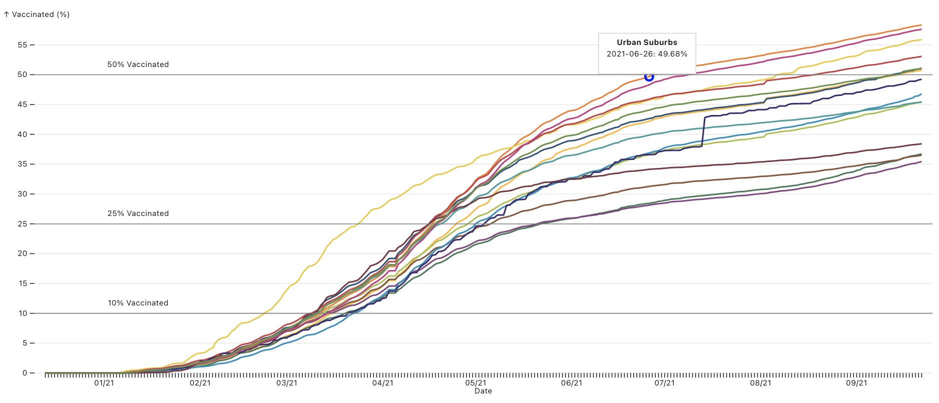
Look at the line chart above and you will see sharply different slopes for some communities. There are clusters around the 10% and even 25% vaccinated marks, but after that point they tend to climb at very different rates.
For instance, the populations of the Urban Suburbs and Rural Middle America hit the 25% fully vaccinated mark within days of each other (April 18 and April 21, respectively), but then the Urban Suburbs shot up. They hit the 50% mark on July 1 and the 60% mark on October 6. As noted above, Rural Middle America has yet to hit 50% of its population vaccinated.
In each of the types, parts of the populations were eager to get vaccinated. Most of the types hit the 10% mark within three weeks in March. But after that very different attitudes about Covid vaccines seem to surface depending on the community type.
Those different attitudes continued through the rise of the Delta variant this fall.
Consider the five community types still under 50% fully vaccinated. Since September, they have been on different paths.
The Military Posts and African American South, in particular, have seen their vaccination rate climb sharply, in the eight-point range since this same date in September. The Evangelical Hubs have seen a slower increase, about 6.3 points since September.
Those numbers are above the median increase in vaccination rates in all the types, 6 points.
But the other three types have seen vaccination rates rise more slowly. Working Class Country has climbed by about 5.6 points. Rural Middle America has increased by about 5.3 points. And the Aging Farmlands have inched up only 4.2 points.
Those slow increases, combined with the lower overall vaccination rates in those places, suggest getting the nation on the same page with the vaccine is likely going to take time — if it ever happens.
The combination of factors driving vaccine hesitancy are complicated. Some of it may be about sparsely populated places feeling less threatened because there are fewer large gatherings. Some may be about government distrust, particularly among communities that lean to the right politically as many rural communities do.
But the uptick in at least some of those rural communities is a positive sign we will continue to watch.
The dangers and challenges young people in the United States face are well-known. Gangs and online predators are the subject of podcasts and newsmagazines. And the continuing list of school shootings, from Columbine to Parkland, has sadly become familiar to Americans.
But for many young people, the bigger danger comes from within, in the form of self-harm. Other than unintentional injury, suicide is the leading cause of death for Americans ages 10 to 24, according to the Centers for Disease Control. In 2019, the number for suicide was higher than for homicide, influenza, and liver disease combined in that age group, according to the CDC.
And the problem has only gotten worse for young people in the United States. In the period from 2000–2004, there were 7.0 suicides per 100,000 people in the 10- to 24-year-old age group. By 2015–2019, the figure had climbed to 10.03. That’s an increase of 43%, nationally.
To understand the scale of the challenge, the American Communities Project worked with Center on Rural Innovation to analyze 20 years of suicide figures from the CDC’s WONDER database. That analysis found that suicide rates among young people had risen in every one of the ACP’s 15 community types over that time, from the densely-packed Big Cities to the sparsely-populated Aging Farmlands and everything in between. The work, funded by a grant from the Arthur Blank Family Foundation to study Deaths of Despair in America, shows just how deep the nation’s suicide epidemic goes.
Looking through the ACP’s prism of 15 community types, clear place-based patterns emerge for the suicide rates among 10- to 24-year-olds, the focus of this report.
Rural communities have seen some of the highest rates in suicide in the age group and some of the biggest increases since 2000.
The suicide rates of Native American Lands are far above all the other types, with rates more than double that of some of the other types.
What’s driving the increase in suicides among the young is not fully understood. One commonly cited factor is the rise of smartphones and social media sites and applications. Recent revelations about the toxic impacts of Facebook and Instagram, which is owned by Facebook, have made headlines. A former Facebook employee recently told Congress the company’s internal research found that 13.5% of teen girls said Instagram worsens suicidal thoughts, while 17% of teen girls said Instagram contributes to their eating disorders.
It’s too easy to blame social media entirely for these increases, however. Young people face a range of stressors in their daily lives, and the unsettled political and socioeconomic conditions in the United States in recent years may play a role.
More important, the data show that the community types with the highest youth suicide rates also seem to be the ones with higher rates of suicide for the general population. That is, the numbers suggest there is a place-driven component to the nation’s suicide epidemic linked to a variety of ground-level factors, including access to local mental health-care providers, general community attitudes toward mental health, and differing levels of family and community social capital.
Those place-based differences shed new light on this topic. While there can be little doubt that social media and the “virtual world” play roles in increasing suicide rates among the young (perhaps even a large role), the data in this report present an argument for the importance and power of the physical world. In short, the numbers suggest that where people live and the people with whom they interact in their communities matter a lot.
The ACP has written this piece in advance of our short documentary on teen suicide in rural Park County, Montana, a Graying America community near Bozeman. We sought to understand youth suicide in a rural community at the ground level by talking to people who have been impacted and witnessing how the community is addressing the problem. Early next year, the ACP plans to release the film, funded by the Blank Foundation and the Robert Wood Johnson Foundation. A short trailer is below.
The documentary and this report focus on 10- to 24-year-olds because the suicide increase in this age cohort is especially alarming. It’s a sign that the nation’s challenges around mental health and well-being — including Deaths of Despair from alcohol, drug overdose, and suicide — don’t just affect the nation’s aging white population. The challenges concern all races and ethnicities and even strike at the nation’s youngest populations.
This report is by no means the final word on the issue of youth suicide and geography, but should be an opening for further inquiry.
The Overall Numbers and the Spikes
The chart below shows the suicide rates per 100,000 people in the 10-to-24-year age group in all the ACP types since 2000, broken into five-year intervals. The bars show how the suicide rates in all 15 types have increased since 2000. Some types have experienced greater increases than others, but no community type has been immune.
One noticeable trend in the data: suicide rates are highest among the ACP’s more rural communities. From 2015-2019, the seven community types with the highest rates of youth suicide were:
Aging Farmlands, where the rate is 22.0, but it excludes ages 10 to 14 because those data are not available due to small sample sizes.
On the other end of the spectrum, the community types with the lowest suicide rates are the most urban, the Urban Suburbs (7.9) and Big Cities (8.3).
The urban/rural differences are notable. Even excluding the Native American Lands, which are an outlier in the data (we have devoted a section to them below), the rates in the LDS Enclaves were more than twice what they were in the Big Cities and Urban Suburbs. Other rural community types are more than 60% above those urban areas.
In a sense, the higher numbers in rural America may be surprising. Rural communities are often considered tightly-knit, with strong social capital, while urban communities are described as big and impersonal. And rural communities, such as the Evangelical Hubs, LDS Enclaves, and Aging Farmlands, are places where people tend to know each other well.
However, rural places are also less likely to have easy access to mental health care. The Robert Wood Johnson Foundation’s County Health Rankings and Roadmaps shows the challenges in some communities.
The median Big City county has one mental health-care provider for every 320 people.
The median Evangelical Hub county has one for every 1,280 people.
And there are so few mental health-care providers in the Aging Farmlands, the County Health Rankings doesn’t even measure a median.
To be clear, having more mental health-care providers in a community does not necessarily mean suicide rates are lower.
A couple of community types, the African American South and Hispanic Centers, have even fewer mental health-care providers per capita (one for every 1,310 and one for every 1,530 respectively). Both were below the national average for suicides among the young. Meanwhile, Graying America has a more mental health-care professionals per capita than other rural places, one for every 620 people, but their youth suicide rates consistently still well above the national average.
The lower numbers in the African American South and Hispanic Centers is a trend we saw in Deaths of Despair overall, as well. It may be that deeper familial or community bonds in these places help insulate them from some of the problems rural white communities face.
Why do rural communities see higher suicide rates? There are several theories.
One is isolation. Young people tend to seek out socialization and that can be harder in rural communities. Getting together with friends can be difficult when they live miles away. A related factor can be pressure to conform. On the ACP’s recent trip to Montana, people cited the pressure to fit into standard roles. For young people who are outside what’s considered the social mainstream, particularly in their sexual and gender identities, that pressure can be immense. In small schools and communities, it can be hard for those who are different to find like-minded souls.
Smartphones might actually play favorable and unfavorable roles. Young people in rural communities can use the mobile devices to connect to a much broader world, but that bigger world can also feel very distant to them.
And rural communities, often home to hunters, tend to have more guns. Firearms are the leading means of suicide in the United States.
What’s Happening in Native American Lands
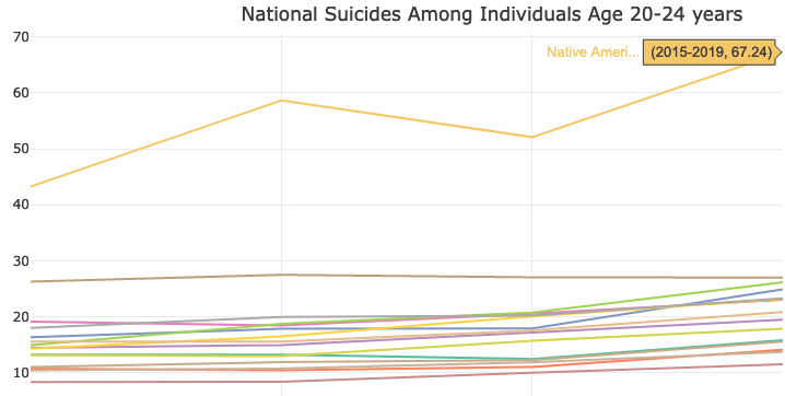
The Native American Lands deserve special attention. The figures in those communities are so far above the rest of the ACP types that they don’t seem to be measuring the same data.
Overall, the figures for the Native American Lands are stark. Among 10- to 24-year-olds, more than 41 people per 100,000 took their own lives annually from 2015 to 2019. In urban areas, such as the Big Cities and Urban Suburbs, the figures look radically different for the same time period. But the figures in the Native American Lands even dwarfed numbers where the suicide among the young is bigger issue, such as LDS Enclaves, the next highest community type with a rate of 17.3 per 100,000.
And even those numbers understate the challenges in the Native American Lands. The figures among older members of the age group, those ages 20 to 24, are extremely troubling. More than 67 per 100,000 people in that age group committed suicide annually in the Native American Lands from 2015 to 2019. The next highest community type for that age group in that period was the Aging Farmlands, where the figure was 27 per 100,000.
When you see the figures for the age group on a line chart with all the other ACP types, you get a sense of the difference.
Many are struggling economically due to a combination of extremely rural locales with little outside investment, low median household incomes, and low college education rates. For young people, the future can look daunting. Add into the mix a lack of mental health-care providers and the issues pile up. Veteran journalist Ray Suarez examined the complex interlocking issues in the Native American Lands in Montana earlier this year.
The numbers show that the mental health challenges begin at a young age in these communities, and would seem to argue for more money and attention on early intervention. The challenges only grow as the population ages.
Communities of Color and Other Points in the Data
One consistent point in the ACP’s work on Deaths of Despair: how a few community types stand against the broader geographic trends in the data, the African American South and Hispanic Centers. Both types tend to be rural, have lower incomes, and lower college education rates. However, their Deaths of Despair figures are consistently lower than other rural communities. That trend continues with suicides among the young.
In 2015-2019, Hispanic Centers’ 8.8 suicides per 100,000 people among 10- to 24-year-olds was close to the lower numbers in the Big Cities and Urban Suburbs. The numbers in the African American South were higher at 9.2 per 100,000, but still below the national figure (10.03) and lower than the numbers in rural white communities. And, as noted above, there are relatively few mental health-care providers in these communities. In fact, the numbers are lower in these communities than in any other, except the Aging Farmlands.
The County Health Rankings shows both of these community types score fairly high for “social associations” (that’s the number of membership associations per 10,000 population). But other community types score higher, including the Aging Farmlands, where the suicide rates are higher.
Looking at several other measures (above-average childhood poverty, below-average high school completion) young people in the African American South and Hispanic Centers face steeper challenges than those living elsewhere. Yet the lower suicide numbers suggest the data are not catching everything. There seems to be a resilience built into these communities that is worthy of more study.
Two youth-oriented communities, College Towns and Military Posts, also present interesting points to study. The ACP tends to view those communities as different sides of the same coin. Both are full of younger people at a critical juncture of their lives, usually living away from home for the first time but on very different paths.
They look quite different in the suicide data for 10- to 24-year-olds. College Towns, at 9.1 suicides per 100,000 people, were below the national average in the 2015-2019 time period, while the Military Posts at 14.5 were well above it. Much is sometimes made of the stresses young people face in college — and the 9.1 figure is higher than the numbers for the Big Cities and Urban Suburbs — but compared to other community types, the College Towns' number is actually fairly low. The number for the Military Posts, however, places it just behind the LDS Enclaves as the community type with the third-highest rate.
That higher rate in the Military Posts could be tied to a variety of other factors. For instance, some soldiers face PTSD upon returning home from the battlefield. And, of course, these communities tend to have a large number of firearms, including stores selling firearms. Guns are far and away the leading means of suicide in the country. In 2019, firearms were used in just over half of all suicides, according to data from the Suicide Prevention Resource Center. The next highest means was suffocation at 29%. It stands to reason that suicides would be higher in a community where firearms are readily available.
Also of note in the urban/rural split, there are differences within urban areas. The Big Cities and Urban Suburbs were both below the national average for youth suicides in the 2015-2019 period, but the Middle Suburbs (10.7 per 100,000) and Exurbs (11.1) were above the national average for suicides among the young. Those higher numbers are somewhat surprising, particularly in the Exurbs, where families tend to have higher incomes and more comfortable lifestyles.
One possible factor is both have fewer mental health providers than their more urban counterparts, one for every 510 people in the Middle Suburbs and one for every 840 in the Exurbs. But another factor could be that those community types have higher percentages of white, non-Hispanic people, 80% in the median Exurban county and 85% in the median Middle Suburb. As mentioned above, suicide seems to be a bigger scourge in white, non-Hispanic communities.
And, in the Exurbs in particular, there may be other pressures. On a trip to Douglas County, Colorado, an Exurb outside of Denver, we heard from local residents about the pressure to “keep up with the Joneses” and try to “have it all.” We heard those stories concerning parents, but they could well be impacting younger people as well.
Conclusions and Next
Taken together, the numbers here show the size of America’s youth suicide problem and the complexities lying under it. The differences in the ACP community types are deep. Some are densely populated and some are very rural. Some are racially and ethnically diverse and others are not. Some are wealthy and others struggle with poverty. But all saw suicides among youth rise in the past two decades.
Yet the differences between the numbers in these places are a sign that easy solutions will likely not be easy to find. Rural communities in particular seem to be facing deeper challenges, but those with large communities of color have avoided the worst numbers. Access to mental health-care providers seems to be an issue, but, looking at the data, it doesn’t appear to be determinative.
It may be that the best way to understand the differences between these places is doing much deeper research and reporting on the ground. The coming ACP short documentary on Park County, Montana, will offer an example of what that kind of look can provide and explore how one community has tried to address the problem. But there is much work to be done. The numbers laid out in this report should mark a first step toward a greater understanding of a troubling and growing problem.
The Covid-19 virus remains a national story, impacting the U.S. economy and health care system, but as time goes by, local disparities are more obvious. Not every community is experiencing the pandemic in the same way, and the differences are increasingly driven by who is and is not vaccinated. Even as stories of “breakthrough infections” appear in the media, the current story with the pandemic is that those who are fully vaccinated are far less likely to get seriously ill than those who are not. And places with lower vaccination rates are more likely to see problems like ICU bed shortages.
Overall, urban communities are much more likely to have high vaccination rates than rural ones, and places that lean Democratic politically are more likely to have gotten the shot than those that lean Republican. However, the story is complicated. There are notable exceptions. And behind those variances is a complicated mix of socioeconomics, demographics, and political beliefs. But the net result is different ACP community types are living in very different realities where the pandemic is concerned.
To be clear, no community typology or county is a monolith. Within and between similar communities, access and response to vaccination efforts may be very different. But the wide variation in the ACP types shows there are broad trends in the data that can help us understand the different community needs and experiences of the pandemic.
You can click through the charts below to look at change in vaccination rates over time by individual counties. The counties are color-coded to match the ACP types. You can use the slider bar on top to move forward or back in time on the chart and click the individual types on the key below to see just those counties. You can also look at the changes over time by type in the line chart. These charts will update automatically daily as new data come in. (Note: Due to incomplete data, Texas and Hawaii were excluded from this analysis.)
That’s an interesting mix of places. The two most urban places, Urban Suburbs and Big Cities, are at the top, which might make sense. They account for roughly 45% of the nation’s population. Those places lean left politically, have higher college education rates, and are densely populated. Those three factors are all indicators for people who tend to be pro-vaccination.
Next highest type on the list, the Native American Lands, stands out for a few reasons. Those communities are not densely populated, and they generally do not feature higher rates of educational attainment, so why are the vaccination rates high? It might have something to do with personal experience. Those communities were hit especially hard in the pandemic, experiencing more than their fair share of deaths. Some reservations in those communities kept outsiders from visiting in the initial surge of the pandemic because case rates and deaths were so high. If you look at the line chart, the Native American Lands were by the far the quickest to get to 25% vaccinated, likely for the same reason.
The College Towns are still above 50%, but perhaps a little lower than might be expected, likely due to the younger populations in these places. Young people have not been hit as hard by Covid and, perhaps because of that, were less likely to get vaccinated. Current demographic trends at the national level show vaccination rates aligning with age, except for the oldest Americans. There was also evidence earlier in the vaccine rollout that more vaccine hesitancy existed among people with PhDs than among the U.S. population in general. Although, vaccine mandates at some schools and universities may have pushed rates higher.
Tightly bunched up, just above 50% vaccinated are Graying America, Middle Suburbs, and Exurbs, which account for roughly one-fifth of the U.S. population. They all just crossed the 50% line in mid-September. The Exurbs are lower than one might expect them, considering their higher levels of educational attainment and quasi-urban settings. Politically, however, they lean to the right (a sign of being anti-vaccine in the pandemic). The same is true for the Middle Suburbs, which tend to be more densely populated but which also tend to lean right politically.
The numbers for Graying America are more surprising and higher than might be expected. Their higher vaccination rates belie the fact that those communities tend to be quite rural and politically conservative — generally markers for lower rates. Driving the higher numbers in these communities may be their graying population, which is more susceptible to the virus.
Vaccination Rates Below 40%
At the other end of the spectrum, four community types have under 40% of their total population fully vaccinated. From the bottom up, they are: Evangelical Hubs, Working Class Country, African American South, and Aging Farmlands. For the most part, the low vaccination rates in these places are not surprising considering where the debate on Covid has moved. These are some of the more rural communities in the American Communities Project, and they are largely politically conservative, though not completely.
The Evangelical Hubs, which sit on the bottom of the county types for vaccines, are among the most politically conservative types in the ACP. Former President Donald Trump won them by about 51 percentage points in 2020 and, in recent weeks, some evangelical Christian groups have risen against the vaccine trying to claim a religious exemption. A Public Religion Research Institute poll in June found only 56% of white evangelical Christians said they had gotten vaccinated against the coronavirus or would get the vaccine as soon as possible.
The Aging Farmlands and Working Class Country counties are similarly very conservative politically (Trump won them both by more than 45 percentage points) and very rural. These are places where there probably is not a great interest in getting the vaccine and where “social distancing” is part of everyday life. There are likely fewer interactions with other people and certainly fewer mass gatherings with strangers.
The African American South, however, sticks out as an exception in this low-vaccine group. Those communities are generally quite rural, but politically they don’t lean right or left. They are very closely divided. Yet, the vaccination rates are very low, just above the Evangelical Hubs at about 37%. Driving those lower numbers may be lingering uncertainty about the vaccine in African American communities and ongoing issues of access to vaccination services. While African Americans have been disproportionately impacted by Covid-19 in terms of contracting the virus, they are getting vaccinated at lower rates, with about 45% of African Americans across 43 states having received one dose of vaccine. This may be due to poorer access to vaccine sites and sign-ups, particularly earlier on, as well as mistrust of the medical system and institutions due to many historical and contemporary instances of systemic medical racism.
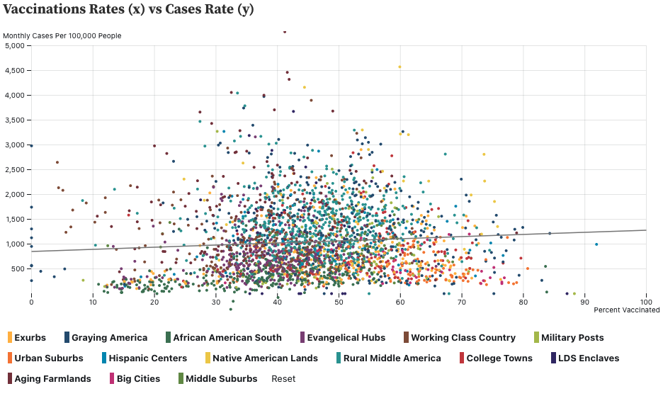
Some Questions in the Data
The scatterplot visualization above raises questions about a few county types. For the entire selection of counties and for most of the ACP types, there is a downward trend in cases as vaccination rates rise, or at least a flattening out. But that pattern does not hold for the African American South and Evangelical Hubs. In those types, cases rise even as vaccination rates increase.
What’s behind that discrepancy? That’s difficult to answer without more research, but one possibility is the rise of the Delta variant and low vaccination rates overall.
If you look at maps of where those communities are primarily located, stretching from the Carolinas through the deep south, north to Kentucky and west to Oklahoma, you see a lot of areas where Delta has been especially problematic. Add a more contagious variant to a set of communities with lower vaccination rates and spikes in new cases are not a surprise.
It should be noted, however, that even as case rates are rising in those communities, deaths are declining in all the types.
What’s Next?
The outlook on Covid rates for the fall and winter seasons remains uncertain for U.S. communities. The charts in this article will continue to update as new data arrive. Resources like the US COVID Atlas can help you track rates in your community.
As always, keep track and follow the guidelines from your county, state, and the CDC to help keep everyone safe, especially the most vulnerable — children, elderly communities, and those with limited immunity. Consider helping your community and family who might be searching for clarity or access to vaccination options.
If you have questions about this data or how to understand the changing Covid landscape, reach out to the American Communities Project and the US COVID Atlas on Twitter.
This post represents the first in a series of analyses looking at vaccination rates, case rates, and deaths across the ACP types. We plan to check in on these data in the coming weeks as conditions on the ground change in our 15 county types.
The country is still growing and becoming much more racially and ethnically diverse, but not evenly. And across most of the ACP’s 15 county types, there are reasons for concern about future growth. These are just two of the findings from the American Communities Project’s analysis of the latest census data.
There were more political notes in the data as well. For instance, the 2020 census may also raise concerns for Republicans in some of the communities that matter most to them, if the party continues on its current track with voters.
The data don’t tell a complete story, of course. They measure change over the last 10 years and are a critical piece of the decennial congressional and statehouse redistricting efforts. And the changes brought about by the Covid-19 pandemic or other, smaller trends over the last five years may be obscured in the data.
Regardless, however, the numbers tell a story of change that is remaking the country and all the ACP types.
Growing Fast and Not At All
Much has been made of the slower population growth rate in the latest census, the increase of 7.4% over the past decade was the second slowest rate of expansion in the history of the decennial census. But reading slower national population growth as an indicator of slow change misses a lot of subtlety in the data.
But the growth within the other 10 community types presents a more complicated picture.
While LDS Enclave Salt Lake County is the urban home of Salt Lake City, the more rural counties around it have grown as well and some by even larger percentages. It’s a sign of the impact of those larger LDS families.
While the large growth in the Exurbs was expected (that’s a hallmark of those communities sitting on the edge of urban areas), the double-digit population increase in Graying America is more of a surprise. Those communities also tend to be more rural, and many are resort locations. Their population growth might be read as a sign of the attitudes and intentions of Americans nearing retirement age.
The growth in Big Cities and Urban Suburbs, meanwhile, indicates that the story about the decline of cities may be exaggerated. The increase in those two densely-populated types is larger than the national number.
Where the Kids Are, and Aren’t
While most of the types in the ACP added population, the majority experienced declines in their populations under 18, the child population. Only four community types increased their under-18 populations — LDS Enclaves, Exurbs, College Towns, and Military Posts. The rest had flat or declining numbers, and some declines were noteworthy.
Diversity Grows Everywhere
The story of the nation growing more diverse is not new. It’s been a driving narrative of the decennial census for decades now. But the speed at which that diversification is happening across the 15 county types in the ACP is remarkable.
The Wall Street Journal’s diversity index, which measures the likelihood that two randomly chosen people are of a different race or ethnicity in a place, reveals some big changes. All the types saw an increase diversity, but in 13 of the 15 ACP types, the diversity index increased by 9 points or more. Only the African American South and Native American Lands saw smaller increases.
Some increases in the index were massive. In Hispanic Centers, the index increased by 20 points. In the Exurbs, it was 16 points. And Graying America saw a 13-point increase in the index.
The increases in the Exurbs and Graying America were especially significant, because they pushed the diversity index in both places above 50 — to 55 in the Exurbs and 51 in Graying America. That means in those communities, there is a greater than 50% chance that any two randomly-selected people will have a different race and ethnicity. The makeup of those communities has long been solidly white, non-Hispanic, and that’s starting to change.
Political Impacts?
The increases in diversity also raise some political questions because of where they are happening, particularly in the Exurbs and Middle Suburbs. Those two types are crucial to the Republican Party. As the GOP has increasingly become the party of rural America, the Exurbs and Middle Suburbs have become its primary connection to urban areas.
In 2020, Trump won the Exurbs and Middle Suburbs by 12 and 11 percentage points, respectively. And in those types, the white, non-Hispanic population declined by 5 and 6 points respectively over the last 10 years.
Considering the GOP’s current heavy reliance on white, non-Hispanic voters, that kind of growing diversity could present a problem if it continues. Already Trump’s margins were down in both communities in 2020 compared to 2016.
The Middle Suburbs were key to Trump’s wins in Michigan, Pennsylvania, and Wisconsin in 2016. Declines in margin in those communities were a crucial part of why he lost those states in 2020.
The demographic changes in the Exurbs may be more troubling for Republicans. Those fast-expanding communities make up big parts of growing Southern states, such as Georgia, North Carolina, and Texas. If GOP margins shrink in those places, it could make it harder to overcome Democratic advantages in the Big Cities and Urban Suburbs. Some erosion of Republican support was apparent in those states’ Exurban communities in 2020.
The 4th of July has come and gone without the United States reaching its Covid-19 vaccination goal — 70% of all adults having at least one dose. In the end, about 67% of adults were poked at least one time by the nation’s birthday.
The American Communities Project offers some insight into where the country is falling short and some idea of why — demographics, geography, and politics all seem to play roles.
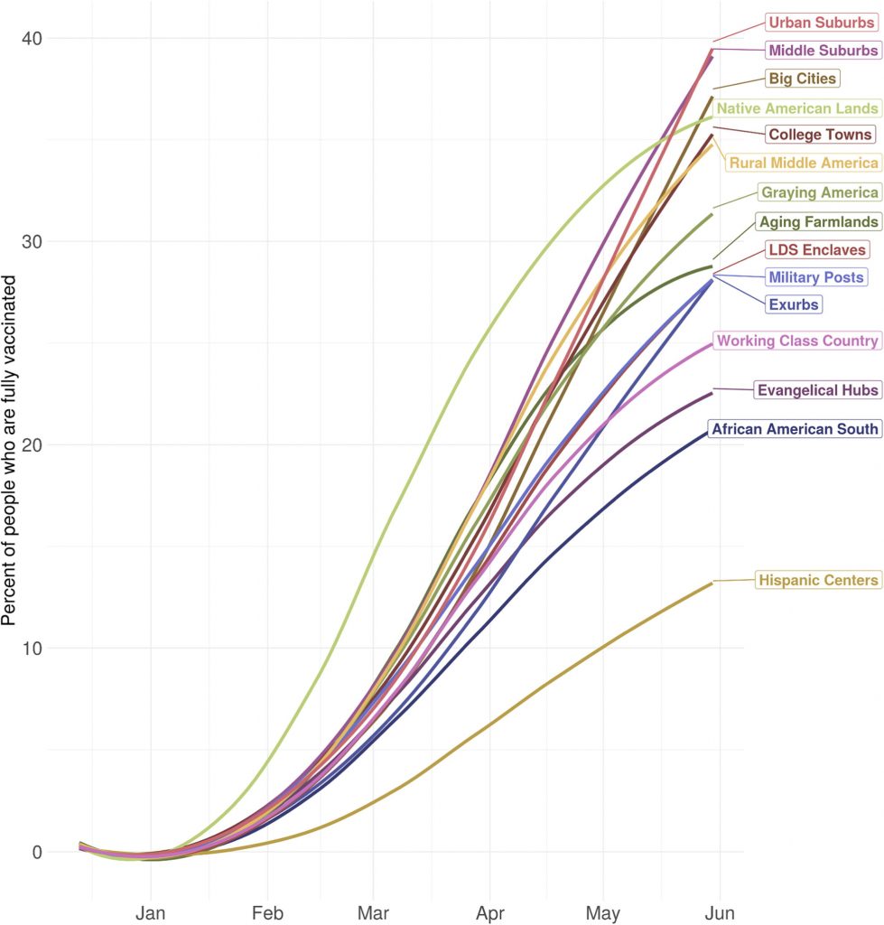
A team of researchers at the University of Pennsylvania recently published a short piece in the journal Vaccine about social media conversations around the Covid vaccine using the American Communities Project types. Beyond the illuminating dissection of the online chatter, the piece also contained the remarkable chart below, showing large disparities in the percentage of people who had been fully vaccinated in each community type through early June.
Covid-19 Vaccination Rates by ACP Type
While the data are not up-to-this-minute, the discrepancies between community types are large and suggest storylines worth exploring.
Communities with Large Minority Populations
The first thing that jumps out in the chart: the lower vaccination rates in Hispanic Centers and the African American South. They are the two lowest types on the chart, and Hispanic Centers are below even 15%.
The reasons are harder to discern. Some of it may be vaccine hesitancy. Early poll data showed these populations were more concerned about the vaccine than other groups. But other factors may include vaccine availability (many of those communities are fairly rural) and fear of losing work time and pay or immigration concerns.
However, Native American Lands stand out at the exception among communities of color. In early June, they were near the top of all the community types, with more than 35% of their population fully vaccinated. That places them up high with large urban communities.
A few points stand out about the Native American Lands. First, they were hit very hard by the virus last year and, for that reason, may have needed less convincing to take get their shots. Second, the tribal lands in those communities tend to have a centralized leadership structure that garners respect. When leaders there spoke, community members were probably more likely to listen.
High Rates in Urban Communities
At the top of the list for fully-vaccinated places in June were the three most densely populated community types in the ACP: Urban Suburbs, Middle Suburbs, and Big Cities. All were north of 35%.
Those communities are very different places. The Urban Suburbs are wealthy with large numbers of people with college degrees. The Big Cities are diverse with a barbelled population — rich and poor, college-educated and not. The Middle Suburbs are generally less-diverse blue-collar communities around big and smaller cities.
They even hold different political leanings: Big Cities and Urban Suburbs lean heavily Democratic while Middle Suburbs tilt Republican.
And yet, despite those dissimilarities, they look very similar in vaccination rates. That suggests that, at least early on in the vaccine campaign, there was an advantage to being more tightly packed into urban areas.
The Riddle of the Exurbs
Proximity and population density doesn’t explain all the differences in the data, however. Rural Middle America and Graying America were both above 30% fully vaccinated in early June. Meanwhile, in the Exurbs, which are often at the edges of metro areas, the fully-vaccinated rate was below 30%.
That number is low for where the Exurbs “should” have been on vaccinations in early June. Those communities are not very rural — many of them are home to good-sized population centers.
They also tend to have higher levels of educational attainment. About 36% of the 25-and-older population has at least a bachelor’s degree. That’s four percentage points higher than the national average. Earlier this year, some opinion surveys found that Americans with higher levels of educational attainment were more likely to want to be vaccinated.
So why is the Exurban rate so low? The divisive political environment may be a factor. Republican Donald Trump won the Exurbs by 12 percentage points in 2020, and the social media analysis by the UPenn team found words such as “Trump” and “fraud” to be big parts of the vaccine conversation in the Exurbs from December to February.
That would help explain the lower vaccination rates in Working Class Country and Evangelical Hubs. These are more rural ACP types where Trump won by more than 40 percentage points in 2020 and where the bachelor’s-degree figures are much lower.
The larger questions are whether these community type differences persist, to what degree, and for how long? Some disparities, in availability and hesitancy, and were bound to be a part of the initial vaccine rollout, but as time goes on and the Covid variants continue, the situation becomes more serious.
Unemployment data confirm that, indeed, there is a Covid-19 economic recovery working its way through all the types in the American Communities Project. But that recovery is not equal. The data suggest rural places are coming back sooner, and there is still a lot of room for recovery in the nation’s most urban places in particular.
From December to the end of April, as vaccinations ramped up, unemployment fell in nearly all of the ACP’s 15 community types — Native American Lands were the one exception. But going back over a longer period of time to the beginning of the pandemic, unemployment is still above where it was in February 2020 in nearly all the types. It is still particularly high in the Big Cities and Urban Suburbs.
Furthermore, when you alter the lens to look at labor force participation, some communities are seeing a slower return to work than others. Three communities stand out: the Urban Suburbs, Middle Suburbs, and Rural Middle America.
The data, from the latest Local Area Unemployment Statistics update, only go through April and the employment landscape is changing rapidly. However, the ACP’s analysis offers insights into how and where the economy is making the biggest strides in returning to “normal.”
The Exurbs stand out as different from the rest of those places because of their higher college-education rates and population density. But there is one common trait all those communities share: On the whole they are not racially or ethnically diverse. In each of the seven types,the median county is at least 80% white and non-Hispanic.
When you look at more racially and ethnically diverse rural places in the ACP, the unemployment rate was higher, in some places much higher. In the African American South, the unemployment rate was 5.6%, but in Hispanic Centers and Native American Lands, the rate was above 8% — 8.4% and 8.7%, respectively.
In some ways, those numbers suggest a return to “normal,” in that those communities of color had higher unemployment rates even before the pandemic. But the numbers are also a signal to proceed with caution. For all the talk of “jobs returning” and perhaps less need for economic aid, unemployment rates above 8% can cause real hardship. It means in those communities alone, there are nearly 900,000 people who are looking for a job and can’t find one.
And notably, the most urban community types in the ACP — the Big Cities and Urban Suburbs — have unemployment rates above 5%. That’s important because those 153 counties hold roughly half of the nation’s population and, as a group, they usually sit at or below the national unemployment figure. They drive the U.S. economy. It’s going to be nearly impossible for the nation to see a full economic recovery without those places improving.
Urban Areas Hit Harder in Long-Term Unemployment Changes
The problems in the nation’s more urban areas look more problematic when you consider where the unemployment rate in those places stood before the pandemic. The increase in the unemployment rate from February 2020 to April 2021 is highest in the Big Cities and Urban Suburbs.
The figure is 2.4 points higher in the Urban Suburbs and a massive 3.7 points higher in the Big City counties. There are currently more than 5 million people who are unemployed in those counties. If their unemployment rates were at their pre-pandemic levels, there would be about 2.6 million unemployed in them.
Why are the numbers so high? A number of factors could be at play. Many urban schools shifted to remote learning in the pandemic and that meant parents often had to stay home to watch children. But the bigger impact likely came from the change in office work culture and business travel in the pandemic that hit the service sector.
Big Cities and Urban Suburbs are home to a lot of office buildings and office jobs. When that work got shifted to home, it meant there was less need for restaurants and cafés to serve those offices. The pandemic also meant less business travel, which in turn meant fewer hotel stays and fewer meals out.
The numbers suggest that a full “turn around” in these locales may not be possible until workers are back in their offices and traveling again. And there are questions about what that workplace return could look like. Many employers are discussing only partial office returns at least through the end of 2021. That may mean a need for fewer service employees in the establishments that serve them.
A few rural locations stood out in the data for actually having slightly lower unemployment rates in April 2021 than they did in February 2020 — Aging Farmlands and Working Class Country. But these county-level data are “not seasonally adjusted” and some of those improvements may be due to those rural communities having different employment patterns in the spring than they do in the winter. At the very least, the figures suggest those communities are closer to their pre-pandemic norms.
Labor Force Participation
One other factor that’s going to have to change for the nation to get back on track economically: the number of Americans actively searching for a job, the labor force participation number. In April 2021, the number was roughly 160 million people. That was 3.8 million below the number in February 2020.
The labor force participation number is what is used to calculate the unemployment rate. So, in a sense, the current unemployment rate is probably understating the number of people who are actually out of work. Many Americans may simply have stopped looking for a job because there weren’t positions available for them — jobs they have the training and skills to perform.
But in the ACP, a few community types stand out for their change in labor force participation since the beginning of the pandemic.
The Urban Suburbs, Middle Suburbs, and Rural Middle America have all seen declines of 3% or more in labor force participation since the pandemic began. In total, 1.8 million fewer people were looking for jobs in those communities in April 2021 than in February 2020. The biggest drop came in the densely populated Urban Suburbs, where the number was 1.2 million lower.
The Urban Suburbs and Middle Suburbs share some common traits. They are often located in and around major metros. And the April data showed their labor force participation numbers actually shrunk slightly between December and April. That may have something to do with people getting temporary jobs during the holiday season in those big metros.
Rural Middle America is different. Those communities tend to be based around small towns. Even though their labor force participation numbers are still down sharply from pre-pandemic levels, the latest months (from December to April) show a slight increase, suggesting things are improving in these places.
And, again, rural communities seem to be showing a bigger bounce back. Graying America and Aging Farmlands are only showing small declines in labor force participation between February 2020 and April 2021, and the growing LDS Enclaves actually showed an increase.
The ACP will dive into these numbers again in a few months. Summer travel, which looks as though it will be heavily based in the United States due to Covid-19, may provide an extra kick to these some of the rural communities, which draw vacationers. Graying America — in the Upper Midwest, on the East and West Coasts, and in the Mountain West — may be particularly well-positioned.
The Politics of Covid
Throughout the pandemic, Covid-19 has often been viewed through a political frame. If one brings that view to the recovery, it is fair to say that, at the moment, communities that voted for former President Donald Trump are actually doing fairly well.
Of the seven community types with an unemployment rate below 5%, six voted for Trump in 2020. Meanwhile, the communities that have seen the biggest increases in unemployment since the pandemic began, the Urban Suburbs and Big Cities, went for President Joe Biden by large margins.
Ultimately, those differences are less about politics than they are about broader economic and population patterns. However, this should serve as a reminder in these hyper-partisan times that Washington’s pandemic policy does not seem to follow simple blue/red — reward/punish lines.

 Stephen Love is President/CEO of the Dallas-Fort Worth Hospital Council.
 Rich Harwood is President & Founder of