How Vaccine Trends Compare Across Community Types
The Covid-19 virus remains a national story, impacting the U.S. economy and health care system, but as time goes by, local disparities are more obvious. Not every community is experiencing the pandemic in the same way, and the differences are increasingly driven by who is and is not vaccinated. Even as stories of “breakthrough infections” appear in the media, the current story with the pandemic is that those who are fully vaccinated are far less likely to get seriously ill than those who are not. And places with lower vaccination rates are more likely to see problems like ICU bed shortages.
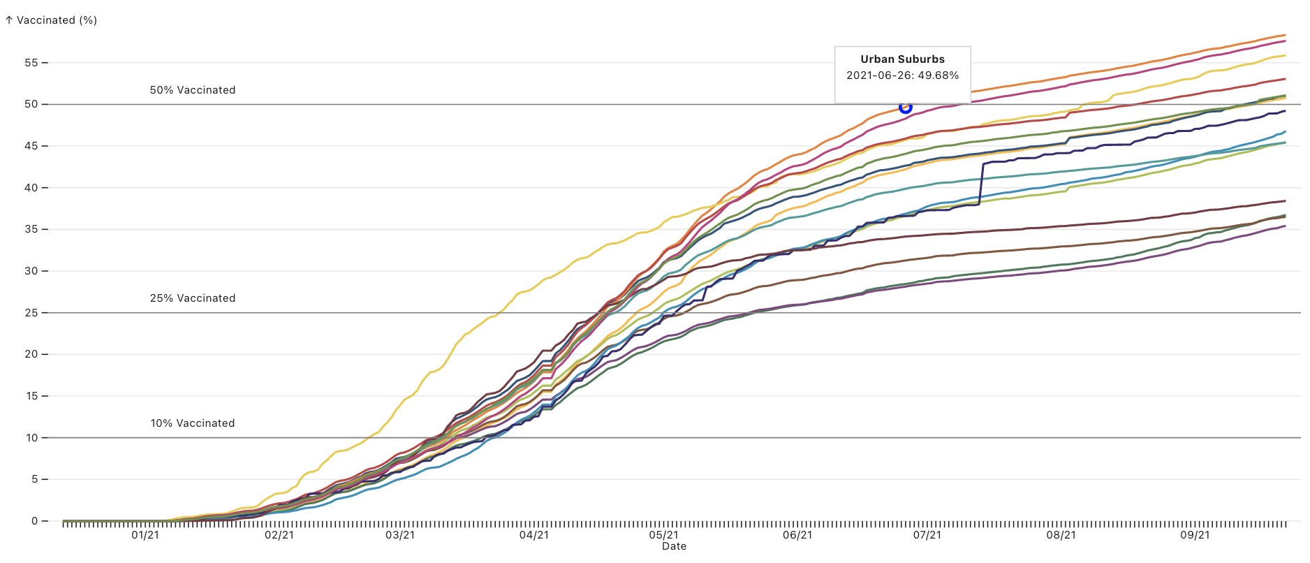
About 52% of all Americans are fully vaccinated nationwide, but viewed through the lens of the 15 county types in American Communities Project, the vaccination stories in the United States look very different. Some county types are hovering near 60% of the total population fully vaccinated, others are far lower, near 35%, according to an analysis from the US COVID Atlas at the Center for Spatial Data Science at University of Chicago and the ACP at Michigan State University.
Overall, urban communities are much more likely to have high vaccination rates than rural ones, and places that lean Democratic politically are more likely to have gotten the shot than those that lean Republican. However, the story is complicated. There are notable exceptions. And behind those variances is a complicated mix of socioeconomics, demographics, and political beliefs. But the net result is different ACP community types are living in very different realities where the pandemic is concerned.
To be clear, no community typology or county is a monolith. Within and between similar communities, access and response to vaccination efforts may be very different. But the wide variation in the ACP types shows there are broad trends in the data that can help us understand the different community needs and experiences of the pandemic.
You can click through the charts below to look at change in vaccination rates over time by individual counties. The counties are color-coded to match the ACP types. You can use the slider bar on top to move forward or back in time on the chart and click the individual types on the key below to see just those counties. You can also look at the changes over time by type in the line chart. These charts will update automatically daily as new data come in. (Note: Due to incomplete data, Texas and Hawaii were excluded from this analysis.)
Vaccination Rates Above 50%
There are seven county types where more than 50% of the total population is vaccinated. They are, in order of vaccination rate as of September 24: the Urban Suburbs, Big Cities, Native American Lands, College Towns, Graying America, Middle Suburbs, and Exurbs.
That’s an interesting mix of places. The two most urban places, Urban Suburbs and Big Cities, are at the top, which might make sense. They account for roughly 45% of the nation’s population. Those places lean left politically, have higher college education rates, and are densely populated. Those three factors are all indicators for people who tend to be pro-vaccination.
Next highest type on the list, the Native American Lands, stands out for a few reasons. Those communities are not densely populated, and they generally do not feature higher rates of educational attainment, so why are the vaccination rates high? It might have something to do with personal experience. Those communities were hit especially hard in the pandemic, experiencing more than their fair share of deaths. Some reservations in those communities kept outsiders from visiting in the initial surge of the pandemic because case rates and deaths were so high. If you look at the line chart, the Native American Lands were by the far the quickest to get to 25% vaccinated, likely for the same reason.
The College Towns are still above 50%, but perhaps a little lower than might be expected, likely due to the younger populations in these places. Young people have not been hit as hard by Covid and, perhaps because of that, were less likely to get vaccinated. Current demographic trends at the national level show vaccination rates aligning with age, except for the oldest Americans. There was also evidence earlier in the vaccine rollout that more vaccine hesitancy existed among people with PhDs than among the U.S. population in general. Although, vaccine mandates at some schools and universities may have pushed rates higher.
Tightly bunched up, just above 50% vaccinated are Graying America, Middle Suburbs, and Exurbs, which account for roughly one-fifth of the U.S. population. They all just crossed the 50% line in mid-September. The Exurbs are lower than one might expect them, considering their higher levels of educational attainment and quasi-urban settings. Politically, however, they lean to the right (a sign of being anti-vaccine in the pandemic). The same is true for the Middle Suburbs, which tend to be more densely populated but which also tend to lean right politically.
The numbers for Graying America are more surprising and higher than might be expected. Their higher vaccination rates belie the fact that those communities tend to be quite rural and politically conservative — generally markers for lower rates. Driving the higher numbers in these communities may be their graying population, which is more susceptible to the virus.
Vaccination Rates Below 40%
At the other end of the spectrum, four community types have under 40% of their total population fully vaccinated. From the bottom up, they are: Evangelical Hubs, Working Class Country, African American South, and Aging Farmlands. For the most part, the low vaccination rates in these places are not surprising considering where the debate on Covid has moved. These are some of the more rural communities in the American Communities Project, and they are largely politically conservative, though not completely.
The Evangelical Hubs, which sit on the bottom of the county types for vaccines, are among the most politically conservative types in the ACP. Former President Donald Trump won them by about 51 percentage points in 2020 and, in recent weeks, some evangelical Christian groups have risen against the vaccine trying to claim a religious exemption. A Public Religion Research Institute poll in June found only 56% of white evangelical Christians said they had gotten vaccinated against the coronavirus or would get the vaccine as soon as possible.
The Aging Farmlands and Working Class Country counties are similarly very conservative politically (Trump won them both by more than 45 percentage points) and very rural. These are places where there probably is not a great interest in getting the vaccine and where “social distancing” is part of everyday life. There are likely fewer interactions with other people and certainly fewer mass gatherings with strangers.
The African American South, however, sticks out as an exception in this low-vaccine group. Those communities are generally quite rural, but politically they don’t lean right or left. They are very closely divided. Yet, the vaccination rates are very low, just above the Evangelical Hubs at about 37%. Driving those lower numbers may be lingering uncertainty about the vaccine in African American communities and ongoing issues of access to vaccination services. While African Americans have been disproportionately impacted by Covid-19 in terms of contracting the virus, they are getting vaccinated at lower rates, with about 45% of African Americans across 43 states having received one dose of vaccine. This may be due to poorer access to vaccine sites and sign-ups, particularly earlier on, as well as mistrust of the medical system and institutions due to many historical and contemporary instances of systemic medical racism.
Some Questions in the Data
The scatterplot visualization above raises questions about a few county types. For the entire selection of counties and for most of the ACP types, there is a downward trend in cases as vaccination rates rise, or at least a flattening out. But that pattern does not hold for the African American South and Evangelical Hubs. In those types, cases rise even as vaccination rates increase.
What’s behind that discrepancy? That’s difficult to answer without more research, but one possibility is the rise of the Delta variant and low vaccination rates overall.
If you look at maps of where those communities are primarily located, stretching from the Carolinas through the deep south, north to Kentucky and west to Oklahoma, you see a lot of areas where Delta has been especially problematic. Add a more contagious variant to a set of communities with lower vaccination rates and spikes in new cases are not a surprise.
It should be noted, however, that even as case rates are rising in those communities, deaths are declining in all the types.
What’s Next?
The outlook on Covid rates for the fall and winter seasons remains uncertain for U.S. communities. The charts in this article will continue to update as new data arrive. Resources like the US COVID Atlas can help you track rates in your community.
As always, keep track and follow the guidelines from your county, state, and the CDC to help keep everyone safe, especially the most vulnerable — children, elderly communities, and those with limited immunity. Consider helping your community and family who might be searching for clarity or access to vaccination options.
If you have questions about this data or how to understand the changing Covid landscape, reach out to the American Communities Project and the US COVID Atlas on Twitter.
This post represents the first in a series of analyses looking at vaccination rates, case rates, and deaths across the ACP types. We plan to check in on these data in the coming weeks as conditions on the ground change in our 15 county types.