
What’s Behind the American Communities Project’s New Map and County Classifications
As the American Communities Project continues work on a $2.4 million grant from the Robert Wood Johnson Foundation to study division and fragmentation in the United States, we have reworked the typology that defines the ACP.
Collaborating with the Institute for Public Policy and Social Research at Michigan State University, we have resorted the nation’s 3,142 counties among our 15 types using the most updated data, the five-year American Community Survey from 2020. The new typology was guided by a cluster analysis, but hand edited for consistency with the prior clusters. The result is a map that looks familiar but is clearly different.
Some types, such as the African American South and Working Class Country, got smaller in their tally and became more refined as groups. Others, including the Aging Farmlands and Graying America, have more counties now than they had in the past iteration.
A number of factors are behind the changes in the map.
Some are due to the nation’s shifting population at the county level and other socioeconomic and demographic changes. The first iteration of the ACP map was done with Census data from 2011, and a lot can change in nine years, even after a decade of relatively slow growth.
In addition, the ACP used a slightly different analysis and a different source for the religion data in this new breakdown. This new cluster analysis used religious affiliation data from PRRI’s 2020 Census of American Religion, while the old one came from Association of Religion Data Archive tallies. Those new numbers likely had some impact on the sorting of the Evangelical Hub and LDS Enclave counties.
Even with those changes, though, some of the color patterns from the previous ACP map are visible.
Some community types are marked by broad swaths of counties, such as the purple of the Evangelical Hubs, the green of the African American South, and the aqua of Rural Middle America. The turquoise Hispanic Centers have a similar pattern in different areas. Others look more like dots on the map, such as the pink Big Cities, orange Urban Suburbs, and gold Exurbs. The same is true for the red College Towns or the light green Military Posts.
Exploring Data Differences
Along with that reworked map, the ACP has added a page within the website that allows users to examine the differences among the Project’s 15 community types across scores of data sets. With this new Data Clearinghouse, users can look at everything from income and education levels to HIV prevalence in each of the types.
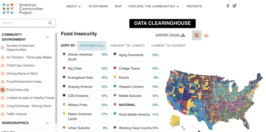
Much of the data on the new page comes from the University of Wisconsin’s County Health Rankings & Roadmaps, but we plan to update it with more data sets as they become available, including the results of our upcoming public opinion surveys.
We feel this addition to the ACP site will help users develop a deeper understanding of just how varied the lived experiences are in the Project’s 15 community types. And we hope you will take the time to dive into this new tool and challenge your thoughts and assumptions about the complicated nature of life in the United States.
Very Different Lives
All the colors and patterns of the new ACP map are really about examining this bigger idea. These 15 community types represent very different kinds of places, full of people living in very different realities, demographically, economically, and culturally.
Looking at the most basic measure of diversity, racial and ethnic differences, shows how the 15 community types look and feel different.
Nationally, about 59% of Americans are white and non-Hispanic. But across the ACP types, the percentage of people in that population varies wildly. In the Aging Farmlands and Rural Middle America, 91% of the population in the median county is white and non-Hispanic. In the Urban Suburbs, the figure is 60%. In the Big Cities, the median county is only 46% white and non-Hispanic. In the Hispanic Centers, only 38% of residents in the median county identify as white and non-Hispanic. In the Native American Lands, the figure is 28%.
Those are massive differences, and they are bound to impact the way the community types see a range of issues — everything from affirmative action to immigration policy.
Median household income variances are immense as well.
The national median household income sits at about $69,700. But the figure is just $42,200 in the median African American South county. Meanwhile, the number sits at $87,700 in the median Urban Suburb. Those data points certainly suggest people living in very different economic worlds.
Even when it comes to participating in the democratic process, the communities look very different. Overall, 68% of the 18-or-older population voted in the 2020 presidential race. But in the different ACP community types, the number ranged from 74% in the median Exurb and Urban Suburb, down to 54% in the median Native American Lands county. Those numbers show how enthusiastic, or unenthusiastic, those communities were in an election that was viewed by many as crucial to the nation’s future.
Electoral Differences
The movement among the types doesn’t have massive effects on the political leanings of each. But some types became more politically homogenous.
The African American South counties tend to have higher African American populations in the new breakdown and lean more solidly Democratic — Hillary Clinton won them by 9 points in 2016, and Joe Biden won them by 10 in 2020. The College Towns are also more solidly Democratic in the new ACP typology, and the biggest factor in any swing seems to be turnout. Clinton won them by only 5 points in 2016, but Biden grew the margin to 10 points in 2020. The Evangelical Hubs and Aging Farmlands both look more solidly Republican than they did before. Trump won them by 59 and 60 points respectively in 2020.
The Hispanic Centers are slightly more Democratic in the new typology. Clinton won them in 2016 and Biden took them in 2020. But there are signs of Republican gains in these communities. In 2020, Biden won them by less than Clinton did four years earlier.
And the uncertainty about former president Donald Trump in the Exurbs, those wealthy college-educated Republican enclaves, is just as pronounced in the new breakdown as it was in the old typology. Trump won them by 16 percentage points in 2016, but by only 11 points in 2020. That roughly mirrors the 6-point drop in the Exurbs in the previous typology.
In the coming months and years, this map will guide the ACP’s work to better understand the forces behind the nation’s economic, cultural, and political fragmentation — and to explore ways to close some of the divides.